Folderprinters > Blog > Professional Grade: CMYK and PMS — In Practical Terms
CMYK and PMS — In Practical Terms
Learn the basics and its relevance to your next printing project.
BY FOLDERPRINTERS WRITERS
May 16, 2023
In the lexicon of professional commercial printing, CMYK and PMS are terms that you encounter.
What do these mean and why do they matter? This article will discuss the significance of these acronyms and how they are relevant, in practical terms, to your printing project.
Both terms are to do with color, each with a specific and unique application in the printing process.
CMYK
The letters in CMYK stand for Cyan, Magenta, Yellow, and Black (the letter K taken from “Key,” as in “Key Color” or “Key Plate,” which uses black ink).
These are the primary colors in the CMYK subtractive color model (for a technical explanation of subtractive colors, you can read this online entry),
which happens to be the dominant printing process in modern commercial printing.
In simple terms, cyan, magenta, yellow and black are methodically mixed by printing each color in dots of varying sizes and frequency (the composition of which is a method called halftoning or screening) to create a composite image that is a reproduction of text, illustration or photograph.
To a certain extent, it is comparable to pointillism, the artistic technique made famous by French post-Impressionist artist Georges Seurat, in which small, distinct dots of paint are applied in patterns on a medium such as canvas to compose and form an image.
This process is also referred to as full-color or, because of the number of primary ink colors used, four-color printing.
Which is why you will often come across printing project specifications written in the following formats: "4/0 (full color printing on one side of the paper; no printing on the other) presentation folders", and "
4/4 (full color printing on both sides of the paper) postcards."
Although four color printing is now the dominant process, there was a time when it was considered a luxury — which may still hold true for large quantity runs due to the massive offset lithography machiines and ink used — but owing to great advancements in digital printing technology,
this no longer holds true, particlary in the lower quantity (less than 1,000) runs.
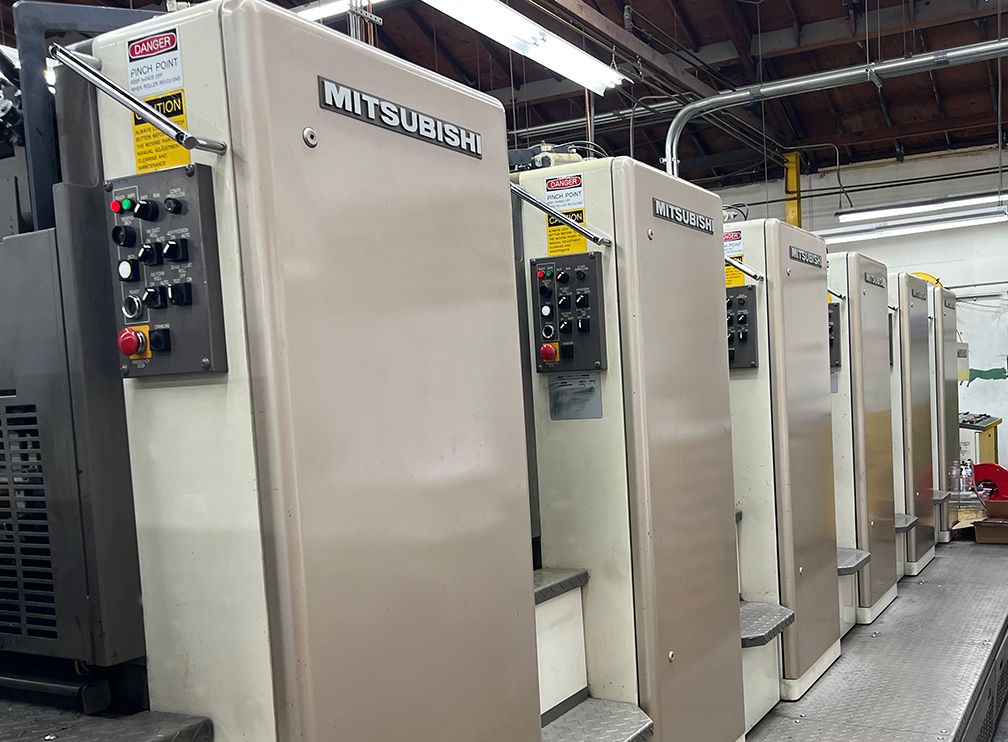
A full-color offset press. Each of the towers is for every one of the CMYK inks. Notice that this model has two more towers for extra custom colors. This massive machine is about seven feet high and 50 feet long.
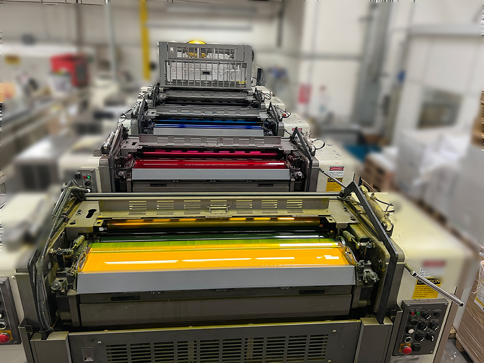
View from the top of the full-color offset machines showing the individual CMYK ink bays and rollers.
Until the late 2000s, offset litho was the preeminent printing technology, within which there existed a segmention of equipment according to size, color and quantity capacity.
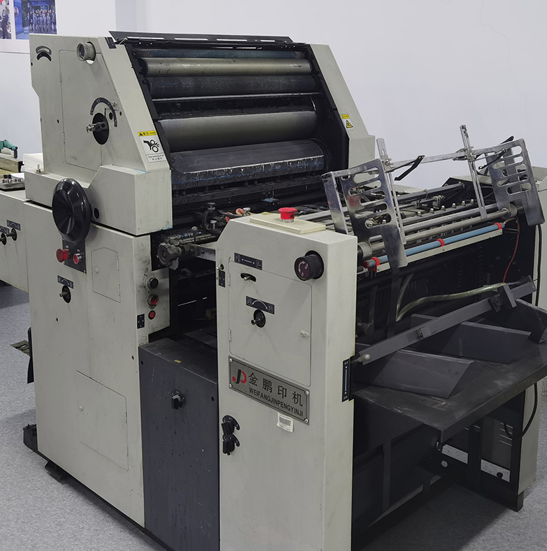
An old one-color offset press. This machine is almost 1/10th the size of the full-color offset press shown above.
Printing companies would have gigantic 40-inch multi-color presses (with their ink and plate towers for each of the CMYK colors) that were designed for job quantities that were in the thousands.
This made them economically impractical to use for, say, 500 flyers.
Unless the customer was willing to pay for the exorbitant cost, the option was to print in one or at most, two colors. Color configurations for which printers also had smaller machines that were appropriately designed and built.
During the early years of its introduction to the professional printing industry about two decades ago, the knock on digital printing was poor image sharpness, color density and vividness.
That was then. Today's latest digital presses produce images that can rival (some would even say surpass) those of traditional offset printing.
Mainly, because digital presses do not need plates and require fewer procedures to operate compared to offset machines, it has changed the economic model for printing in lower quantities, to the extent that full color projects have become quite affordable,
and indeed, makes more sense than printing one-color, assuming the single color is one of or the result of a combination of CMYK.
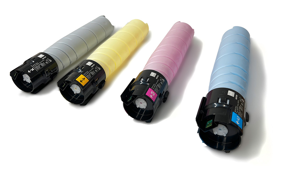
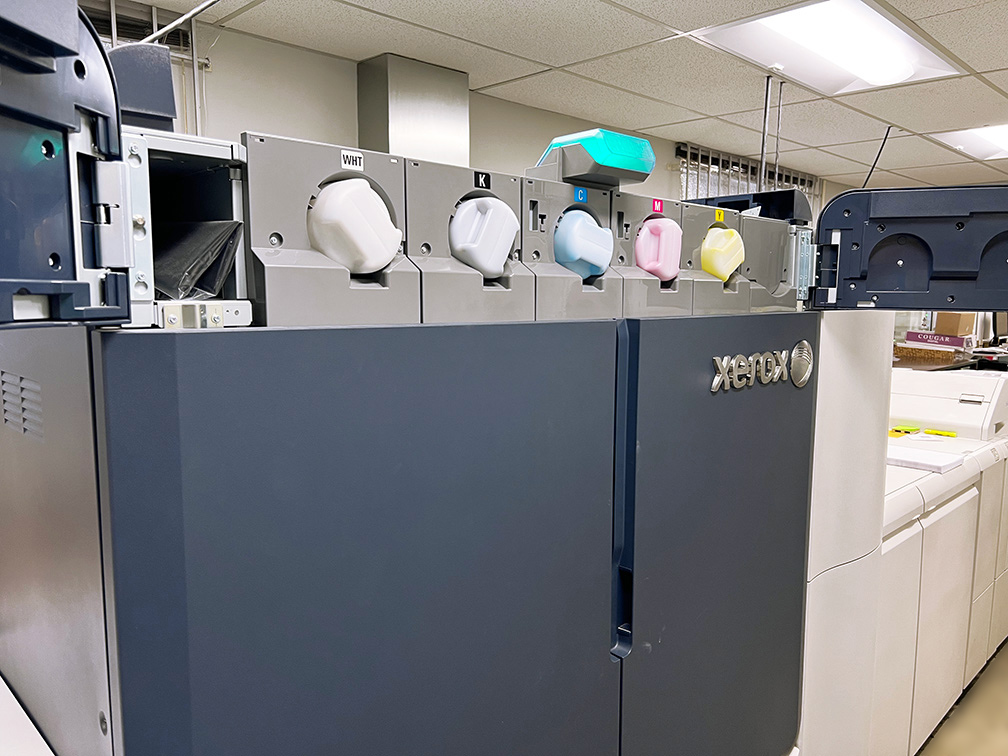
CMYK toners that go in the digital press below.
A modern late-model full color digital press. Notice that the CMYK toners are inserted in slots located in the upper section.
The qualifying assumption at the end of the previous paragraph is critical. Normally, the term "one color" means the use of one ink color from among CMYK;
however, there are situations that specify the use of an ink color that is not one of CMYK. Enter our second acronym: PMS.
PMS
PMS stands for Pantone Matching System, a standardized color matching system developed by Pantone LLC. in which there are over 1,000 standardized colors, each assigned a unique identifying PMS number, which makes it easy to clearly specify a particular color.
PMS is about precision. Unlike CMYK printing which produces images by combining the four colors printed in tiny dots, printing PMS uses ink that is pre-mixed (to a color based on formulas found on Pantone's list).
It is almost always applied in a solid pattern (as opposed to dots, although technically you could but there are extremely few practical reasons to do so).
For this reason —as well as sometimes being an add-on isolated element within a CMYK image — it is also called a spot color.
Because the inks are pre-mixed, the PMS-colored element will consistently appear as it was intended, across all the printed sheets. The value of this level of precision is highly evident in instances in which a color — a specific color — cannot be compromised.
The most common of these instances involves branding, where a color is critical to the identity, character and reputation of an organization or individual.
Perhaps no other color is as inextricability associated with a brand as the "light medium robin egg blue" is to Tiffany & Co. Indeed, only one company comes to mind upon seeing that iconic blue box. The blue, has in fact, come to be known as Tiffany Blue.
So protective is Tiffany & Co. of this part of its identity that it has registered the Tiffany Blue color as a color trademark. Pantone produces it as a private custom color and has designated it PMS 1837, the number deriving from the year of Tiffany's foundation.
Another reason to use PMS is in designs that have metallic elements. While CMYK can be used to "cheat" and simulate the metallic effect, it can never have the right sheen.
Metallic Inks actually have metal particles in them, and are not merely trying to mimic the sheen and sparkle of metal.
Foil stamping is an option but is very expensive. This leaves PMS meatllic ink as the best economic choice.
On a personal level, one possible application of this color precision would be wedding stationery, in which the wedding party might have a strong personal connection with a very speciic color.
Because wedding invitations are most often highly customized, and in many cases produced artisanally with use the leterpresses, it would be reasonable to print in PMS.
While each printing job is in itself a custom project, using PMS ink adds an extra level of customization, making it ultra-bespoke, if you will. Therefore incurring extra cost.
This is mainly due to the fact that, as previously mentioned, CMYK is the now the standard professional printing process, which means that most presses are set up with those four colors, and the use of a custom color outside of CMYK will alter a printer's production flow and set up.
Furthermore, the custom ink needs to be mixed or purchased, and will only be used by the printer (at least for the foreseeable future, unless by some stroke of luck another customer asks for it) for that specific job.
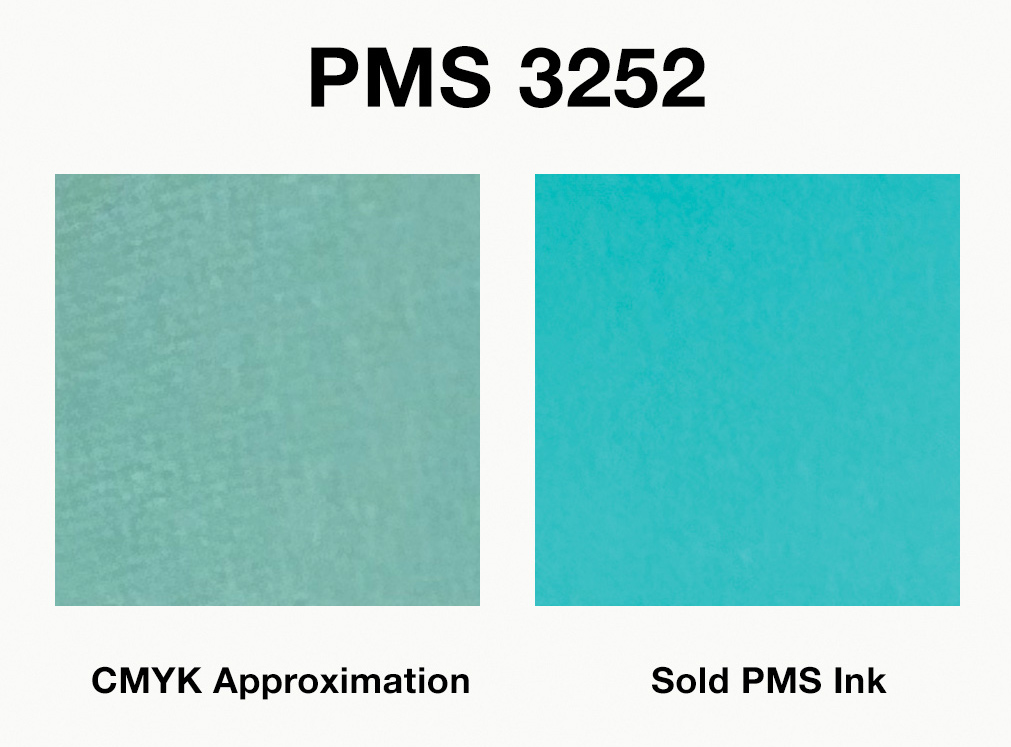
To be sure, PMS colors have their CMYK simulation counterparts. That is to say, a formulaic combination of the four colors is employed to try and mimic the solid PMS color.
But this is just an approximation and almost never appears close to the actual solid PMS color.
PMS 3252 (right) is near the color range of Tiffany Blue. If Tiffany & Co. were too skimp on printing PMS and resorted instead to its CMYK equivalent (left) it would almost certainly hurt its image.
CONCLUSION
Just as it is in any service that you procure, it is good to have a basic idea of the processes involved, even if you will never perform any part of it yourself.
What’s more important is how you will use the service and maximize the benefit of your expense. Like most industries, “digitization” has had a profound impact on the printing industry.
One of which has resulted in the “standardization” of full-color printing. As a printing buyer, you no longer have to fear jargon like CMYK; the choice to go with full-color has become less daunting and expensive.
As marketer, you can now go toe-to-toe in print quality with the competition. But the wide availability of full-color printing means that your competition can also afford it. To separate yourself, one option would be the use of PMS colors.